Add Style
In the previous chapter, we learned how to use components from the third-party library.
In this chapter, we will learn how to implement UI components.
JS components using CSS
First of all, we want to control the display of contact avatars by ourselves, and implement this design draft:

Hypothesis has no ready-made components to implement, so you need to write some CSS yourself. Here we use styled-components to implement similar requirements. Modern.js out of the box supports styled-components, which requires neither dependency nor configuration.
Style-components avoids many problems of traditional CSS writing through modularization. For example, writing styles directly on the style attribute of elements, the visual details of UI will also be mixed with the details of UI structure and business logic. Or classname needs to avoid global space renaming, which requires the use of naming conventions.
Modify the code at the top in src/routes/page.tsx:
Add the following code:
Modify the code of List.Item.Meta:
Execute pnpm run dev to see the expected running result:
Next we do a little refactoring. To enhance legibility and make the code easier to maintain, we can split the Avatar component. We execute the following command at the end point to create a new file:
Delete the <Avatar> implementation in src/routes/page.tsx and change it to:
The content of src/components/Avatar/index.tsx is modified to:
Execute pnpm run dev, the result should be the same.
The reason for using the directory form Avatar/index.tsx instead of the single-file form Avatar.tsx is that you can easily add sub-files inside the directory later, including dedicated resources (pictures, etc.), dedicated sub-components, CSS files, etc.
Utility
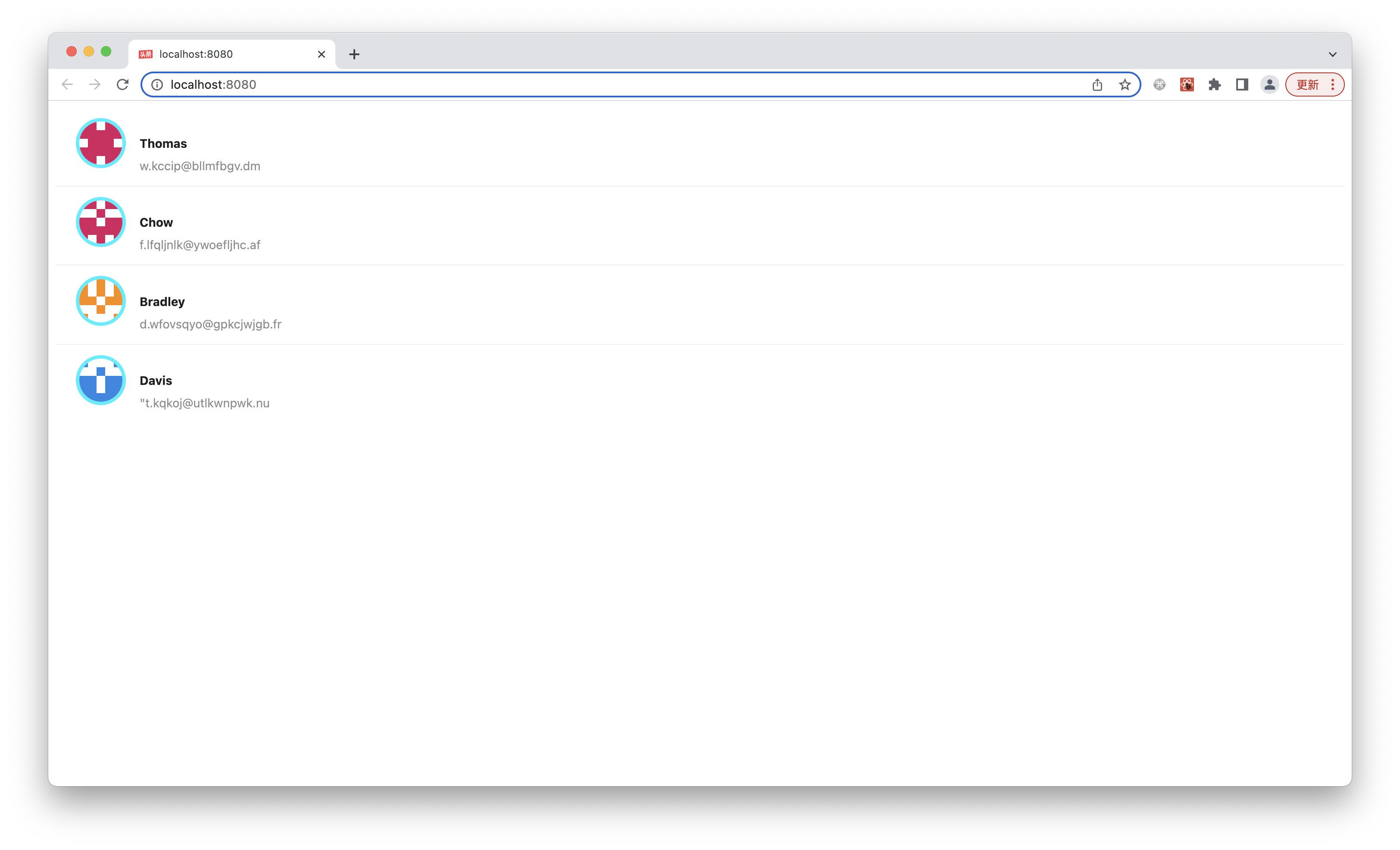
We have used the style-components implementation <Avatar> component, but the current UI is still unsatisfactory and lacks professionalism, such as the list item inhouse layout is a bit rough and misaligned in many places.
Now, let's implement a better Item component ourselves, implementing a design draft like this:

The UI to be implemented this time is more complex and has an internal structure, but on the other hand, there is no very thick bright blue border of the <Avatar> component such a very special UI, which is a very conventional horizontal and vertical layout, centering, font style, etc. In this case, there is actually no need to write CSS at all. There is a more efficient implementation method that complements styled-components: Utility Class.
Modern.js integrates the mainstream, light, general-purpose Utility Class library Tailwind CSS.
Execute pnpm run new and select the following to start Tailwind CSS:
Register the Tailwind plugin in modern.config.ts:
Import the Tailwind CSS css file at the top of src/routes/page.tsx to start a quick implementation of the professional UI:
Create the Item component first:
Modify src/routes/page.tsx to pass the render implementation of List to Item component:
Utility Class(https://tailwindcss.com/docs/container) is used on the parent container for a quick implementation of the most basic maximum width, center, and other styles.
Next implementation src/components/Item/index.tsx:
Execute pnpm run dev to see the expected running result:
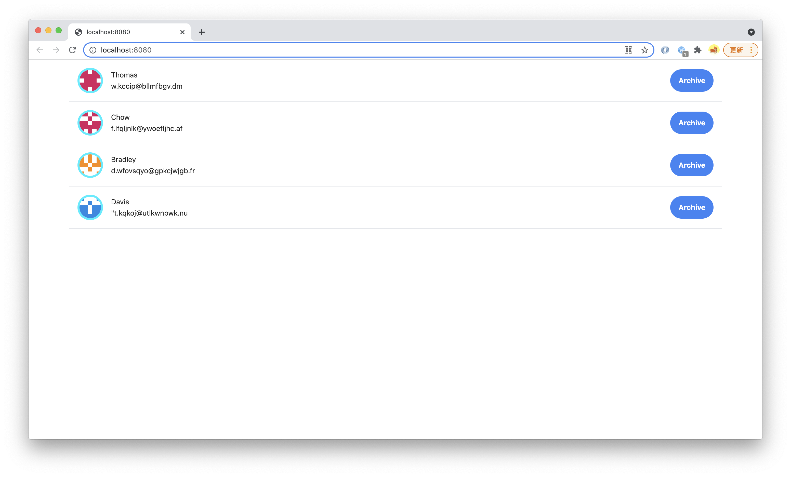
We only use a few Utility Classes, such as Flex, Padding, Margin, Text, Font, Border, without writing a single CSS implementation Professional UI that conforms to the design draft.
Customized Utility Class
We can also implement the new Utility Class ourselves to facilitate reuse between codes.
Utility Class itself is also a component-oriented technology (using different classes on a component is equivalent to setting some attributes from the base class for this component), but the classname of Utility Class is global (because it is used on arbitrary components/elements), it is very suitable for implementation with separate CSS files.
Create a new CSS file:
Import utils.css in src/routes/page.tsx:
A Utility Class named custom-text-gray is implemented in src/routes/styles/utils.css.
Modern.js integrates with PostCSS and supports modern CSS syntax features such as custom properties.
Use in src/components/Item/index.tsx:
Change to:
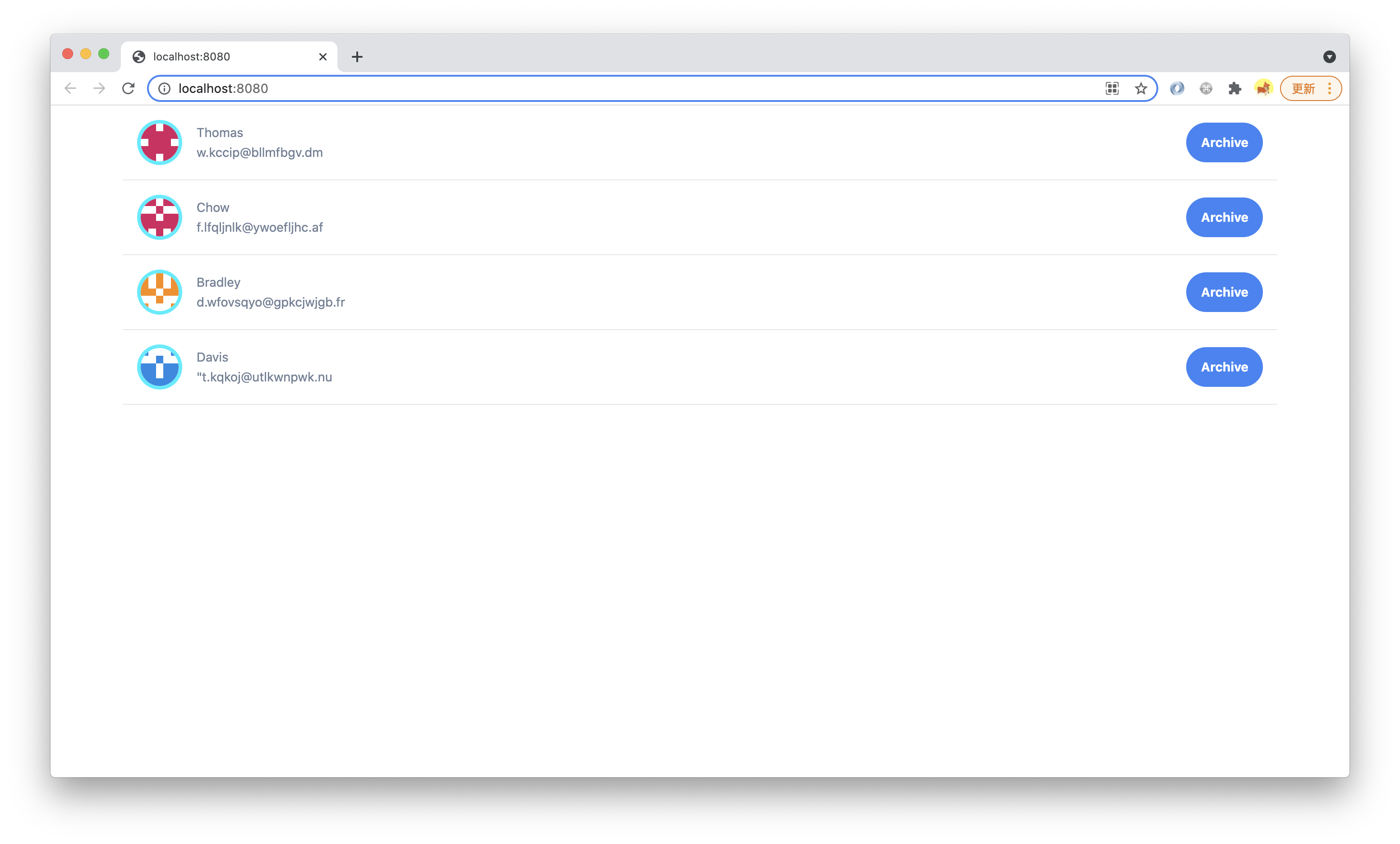
Execute pnpm run dev, you can see that the font color has changed:
This is just to demonstrate Utility Class usage. In a real project, with Tailwind CSS, this Utility Class is of little value and should be added to the font color through the theme of the configuration Design System.
utils.css can also be written as utils.scss or utils.less, Modern.js out of the box support for SCSS and Less.
However, with the support of PostCSS, modern CSS should be sufficient to meet these development needs, and the performance is also better than that of the preprocessor. It is recommended to use .css files first.