Developing Module documentation
This chapter describes how to quickly build a static documentation site for a module project.
Before we start
Why we need to build a documentation site for a module
- a documentation site can help us to better organize the structure of the documentation.
- the documentation site has better presentation, such as the ability to execute functions in the page, render components.
- to make better use of AI search capabilities.
Preliminary preparation
- Enable the documentation feature via micro-generator.
- Read Introduction to Rspress.
After finishing the preparation work, we will build a documentation site for the module project based on Rspress.
Basic site structure
The overall layout of the site consists of three parts: the navigation bar, the sidebar and the body part, which also includes the TOC (Table of contents found at the beginning of a book or document).
The Rspress uses File System Routing, on which the module documentation is based, to automate the generation of the sidebar. For example, if you have the following file structure:
Then the routing path for foo/bar.md will be /foo/bar, the routing path for foo.md will be /foo, and the routing path for index.md will be /.
The specific mapping rules are as follows:
| file-path | routing-path |
|---|---|
index.md |
/ |
/foo.md |
/foo |
/foo/index.md |
/foo/ |
/foo/bar.md |
/foo/bar |
The sidebars corresponding in turn to the above file paths and routing paths are shown below:
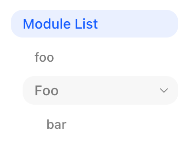
Configure sidebar
As shown in the figure above, the module documentation has automatically generated sidebars for file system routing, where the text of each column of the sidebar is determined by the file's first level title or directory name. If you need to customize the sidebar, please use _meta.json or configure sidebar directly.
If your document directory structure complies with internationalization, for example:
You need to follow internationalization guide and configure lang 和 locales,
otherwise, the automatically generated sidebar of the module will not handle the zh and en directories.
Writing Documentation
Next, we can focus on writing the content of the document. In addition to the basic Markdown syntax, you may also need to understand the following advanced topics:
Component preview
Module documentation provides preview capabilities for component libraries. The contents in code blocks written in jsx and tsx will be parsed as React components.
Example
Here is a complete example using the component preview feature:
Assuming our project name is demo and we export a Button component.
- Add a new
docs/Button.mdxfile:
- In the
tsconfig.json, configure aliases and point the package name to the current project directory, make the way document developers and users use components consistent:
- In the
.gitignore, adddoc_build/:
Congratulations, you have finished writing a component document, execute pnpm run dev to see the result, remember to build the component library first to make sure the component product exists.
Mobile Preview
Also, we support mobile preview mode, i.e. rendering mobile components using iframe, and set iframe position by iframePosition,
support swipe preview and new page opening.
If you only want to change the way a particular jsx and tsx block is previewed, you can use a different modifier to identify it:
Using external demos
If our demo is very complex, then it is recommended to write the demo separately and then use the code tag in the mdx:
This also supports setting the preview method for each individual code block, for example:
Using built-in components
The plugin implements some built-in components internally so that you can develop module documentation more easily.
API
Display the API content of the module.
Parse file
Before we can use the API component, we first need to specify the files to parse:
Content generation
Next, we'll see what kind of markdown content is generated based on the parsed file.
Content can be generated with two different tools, react-docgen-typescript or documentation:
react-docgen-typescriptis targeted at component library scenarios and will only parse props to generate tables.
The above is a standard writeup where ButtonProps will be extracted into the table and Button will be the title of the table.
If you use the default export, the filename will be used as the form title.
Notice that export features declared elsewhere are not available.
The generated content is as follows:
If React types are used in Props, you need to add the types in tsconfig.json, otherwise the types will not be resolved under the React namespace.
The best way is that you import the type directly:
documentationis used in tool library scenarios to parse JSDoc annotations.
The above is a greet function with a JSDoc annotation. The generated content is as follows:
Using the component
Next, you can use our built-in API components in your documentation by passing the key value into the moduleName property。
Overview
Displays a list of modules that can be placed on the front page to display all modules.
The Overview component has only one list property, which receives an array of objects, and the following properties of the objects
| property | description | type | default |
|---|---|---|---|
| icon | icon | React.ReactNode | |
| text | text(required) | string | |
| link | link(required) | string | |
| arrow | whether to show arrows | boolean | false |
Plugin options
apiParseTool
API parse tool.
- Type:
'react-docgen-typescript' | 'documentation' - Default:
'react-docgen-typescript'
doc
entries
Module names and relative paths for automatically generated documents.
- Type:
Entries | ToolEntries - Default:
{}
It also supports the use of different parsing tools for different files:
iframePosition
- 类型:
'follow' | 'fixed' - 默认值:
'follow'
When the value is follow, each code block will have an iframe showing its rendered view.
When fixed, the iframe will be fixed to the right side of the page, showing the view of all the code blocks on the current page.
parseToolOptions
API parse tool options.
- Type:
ParseToolOptions - Default:
{}
previewMode
- Type:
'iframe' | 'internal' - Default:
'internal'
In case of internal, the component will be rendered directly in the page, otherwise it will be loaded through an iframe.
deprecated: languages
Starting from version 2.44.0, please refer to the Internationalization section to implement multiple languages.
deprecated: useModuleSidebar
Starting from version 2.44.0, a sniffing mechanism has been implemented internally, so please directly use _meta.json or directly configure sidebar to implement a custom sidebar.
Scripts
modern dev: Start dev server for doc site.modern build --platform: Build doc site in production, by default output directories isdoc_build.
Advanced guide
The above has covered the basics of developing module documentation, but this is not enough for developing a complete documentation station. Check out the Rspress for an in-depth look at our documentation framework.
You can modify the documentation framework configuration via the doc configuration.