Add UI Components
In the previous chapter, we learned how to initialize a project and use configuration to modify the default behavior of Modern.js.
In this chapter, we continue to use the project code of the previous chapter and continue to improve the point of contact list.
In order to do better UI display and interaction, we introduce the component library Antd to develop, and use the <List> component instead of the primitive list. Add dependency first:
Modify src/routes/page.tsx to import components at the top:
Modify the implementation of the <App> component:
Execute pnpm run dev to see the running results:
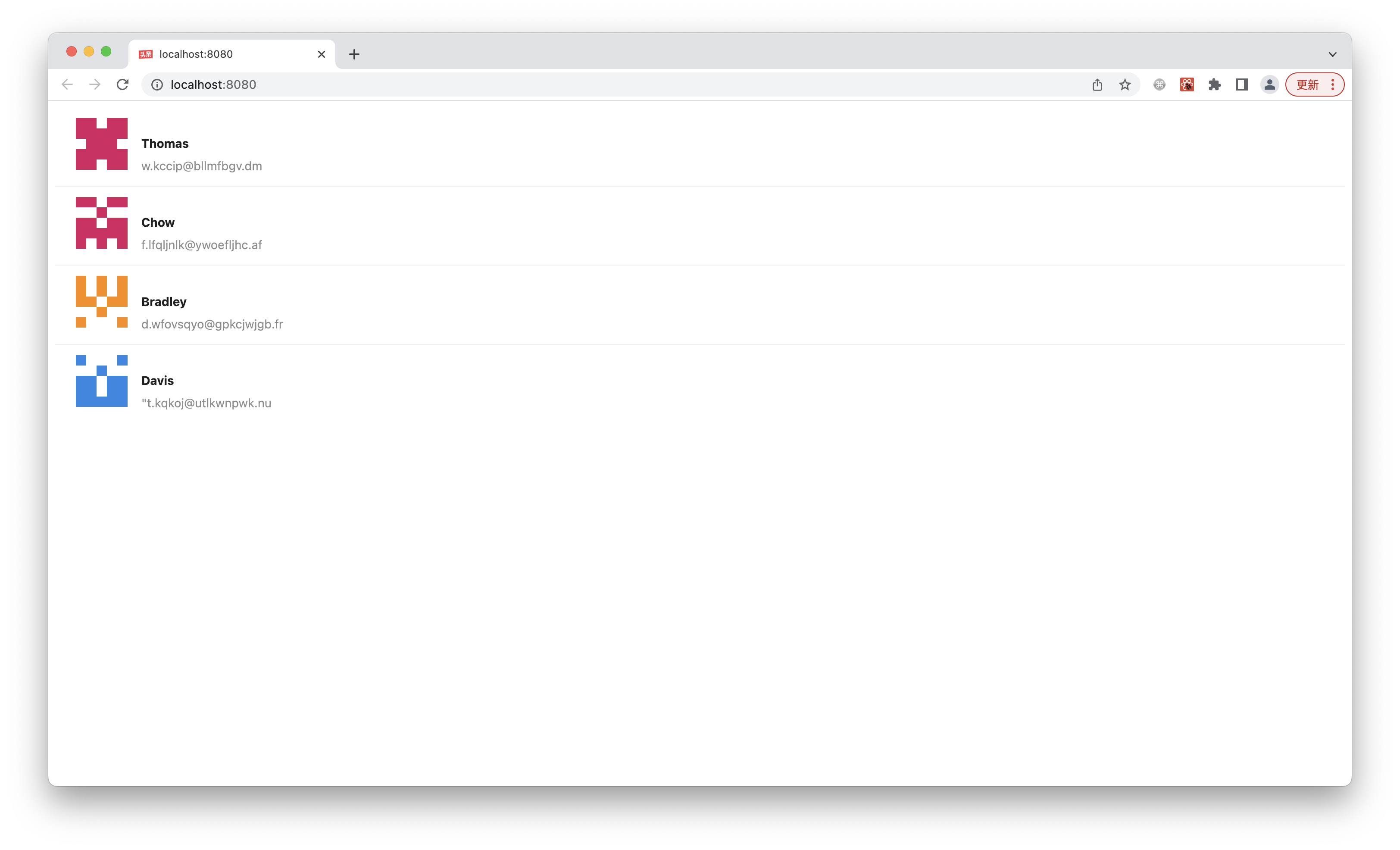
You can see that the components exported by Ant Design already have complete styles.
We can also use other component libraries to implement the same functionality, such as Arco Design.